The Benefits of Good Design
More often than not, you’ll notice a bad design before you notice a good one. We notice bad designs more because they tend to affect our lives in negative ways. Cannot figure out where to reach support on a website? Take more than four clicks to get to the most important information? Forget which setting you should use on your blender? Bad designs waste your time and make the experience painful.
Good designs, on the other hand, save you time and help you accomplish your task more effectively. Roofing shovels are designed to help ply out nails and remove shingles. Some phones wake up the screen as you move them from your head so you can access or input information easily. Good designs take time and aren’t afraid to change as the needs or desires of the user evolve. I think the primary struggle of most designers centers around the balance between functionality and accessibility. A watch that can cook you dinner is a fantastic tool — but if you need to read a manual to set the time you’ve missed the mark.
The other day I was staring at a binary clock I had purchased some years ago at a museum gift shop. I was bored and decided to open it up. It turns out that the clock was very well designed!
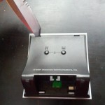
 The face of the clock detached easily from the base because it was held together by plastic tabs. Many tablets and phones use this same plastic clip philosophy to hold the glass screen to the case. I had the good fortune of being able to use a knife to pry apart the device because the clips were so large. Allowing the user to disassemble the device in case of repair or modification is a sign of good design.
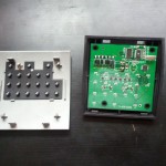
Opening the device revealed a simple plastic optical channel to funnel the LED light from the board to the user. The board is not glued in, but is held in place by thin plastic rods that are part of the cover. I needed no special tools to remove the board from its housing.
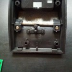
The bare case also contained a cheap metal bar to make the clock feel more expensive. This is still a common problem with cell phones and other products; as devices become lighter, thinner, and are composed of different materials, it becomes more difficult to justify the cost and reputation of the device to the user. People like to “get more” for their money, so to speak.
You will also note that the metal bar is being held in by standard Phillips screws. No special tools required for the deconstruction.
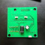
Now let’s look at the circuit board itself. The front of the board is clearly labelled, and all of the components are identified. You will also note that there are several extra holes on the board. This not only saves weight, but it also allows others to mount extra components should they see fit — a big win for makers and tinkerers.
 The back of the board is designed just as well. Large surface mount points for the AC connector, buttons, and capacitor allow users to replace the components should they fail. A three cent resister is a much less expensive proposition than a device where the whole board must be disposed of.
 Here you can see the board in action. According to the markings this board was designed in 2004.
So why was this binary clock designed so well?
- You can easily disassemble the product using standard tools.
- The components are clearly marked.
- The components are mounted in such a way to make repair possible.
- The board provides opportunities for tinkers to mount their own components to the board.
Devices that are constructed in this manner can only benefit the user. There is a manifesto that has circulated around the internet that says “if you cannot fix it, you do not own it”. Of course, given the rapid and complex advances in technology, I hardly expect the average person to be able to repair his computer. That doesn’t mean we still cannot design things well by making those components which are user-serviceable accessible, like the CMOS battery or memory. Indeed, good designs may evolve over time, but the core qualities — accessibly, easy to use, and efficiency — stay the same.


This Post Has 0 Comments